Project Goals
The goal was to design a website that clearly communicates Product Advisory’s mission while supporting growth and scalability. I focused on clarity, conversion, and future-proof design.
- Communicate a multi-layered program (funding, mentorship, co-founder matching) clearly and engagingly
- Design a website structure that serves multiple audiences
- Create a scalable layout for future features and content
- Develop a clean, modern UI that builds trust and reflects the brand
- Drive conversions for applications and advisor signups
Site Structure
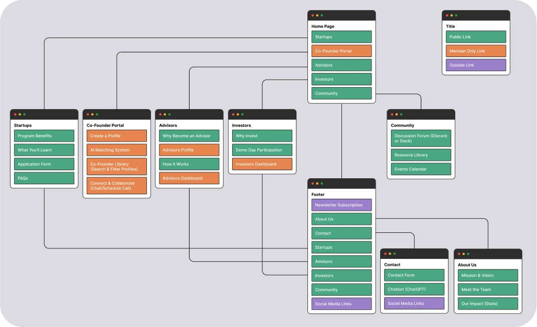
One of the biggest challenges in designing the Product Advisory website was organizing a wide range of information for different audiences—startups, advisors, and investors—while keeping the experience simple and easy to navigate.
I worked closely with the CEO to define the site’s main sections and user journeys, and started by building a clean, scalable sitemap to establish the website’s core structure. This helped clarify user flows and ensure that key content like the application process, co-founder portal, and advisor onboarding were easy to find.
Key goals for the IA:
- Prioritize clarity and reduce cognitive load
- Balance storytelling with clear calls to action
- Create dedicated paths for each user type (startups, advisors, investors)
- Lay the groundwork for future pages and platform features
Visual Designs
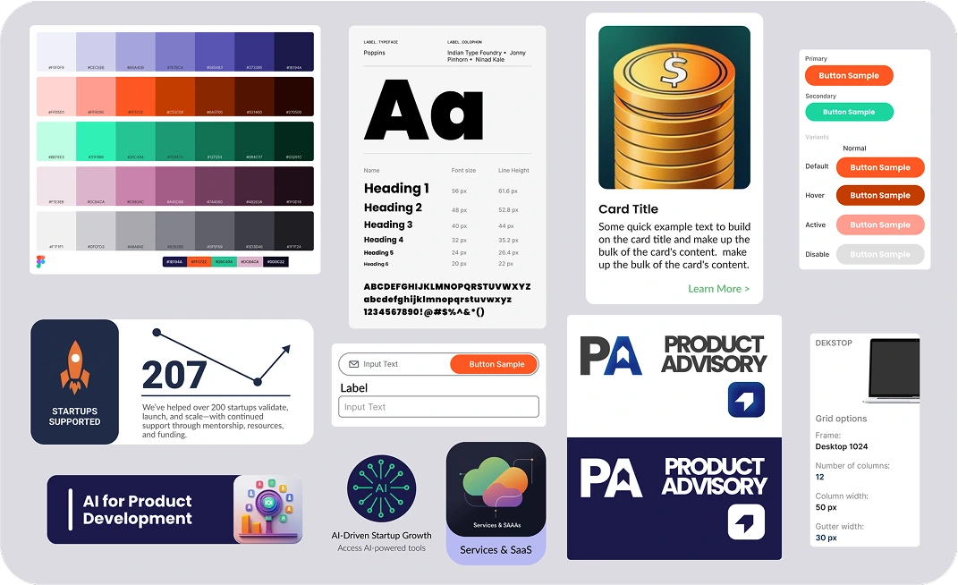
Once the structure was finalized, I focused on building a visual system that felt modern, professional, and accessible—aligned with Product Advisory’s mission to support entrepreneurs at every stage. I introduced a bold color palette featuring deep navy, vibrant green, fiery orange, and soft purple to balance energy with trust and clarity.
For typography, I combined Poppins for headings (to create bold, geometric impact) with Lato for body text (for its clean, humanist readability). Together, they help establish a clear visual hierarchy while keeping the interface approachable and easy to read.
I also designed a consistent component library—including cards, buttons, and icon systems—to ensure design consistency across the site. The layout was structured around a clean grid system with intentional white space, giving the content room to breathe and improving scannability across all screen sizes.
Key Pages
A few key screens from the site show how I combined clarity, hierarchy, and modern visuals to guide users through the experience.
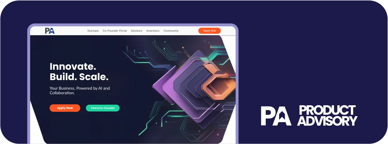
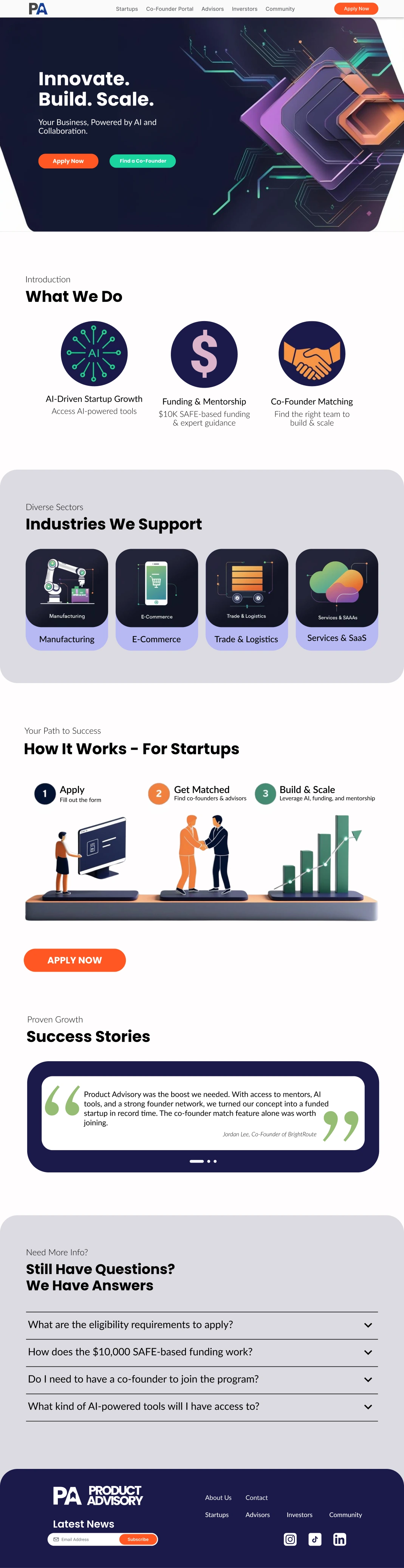
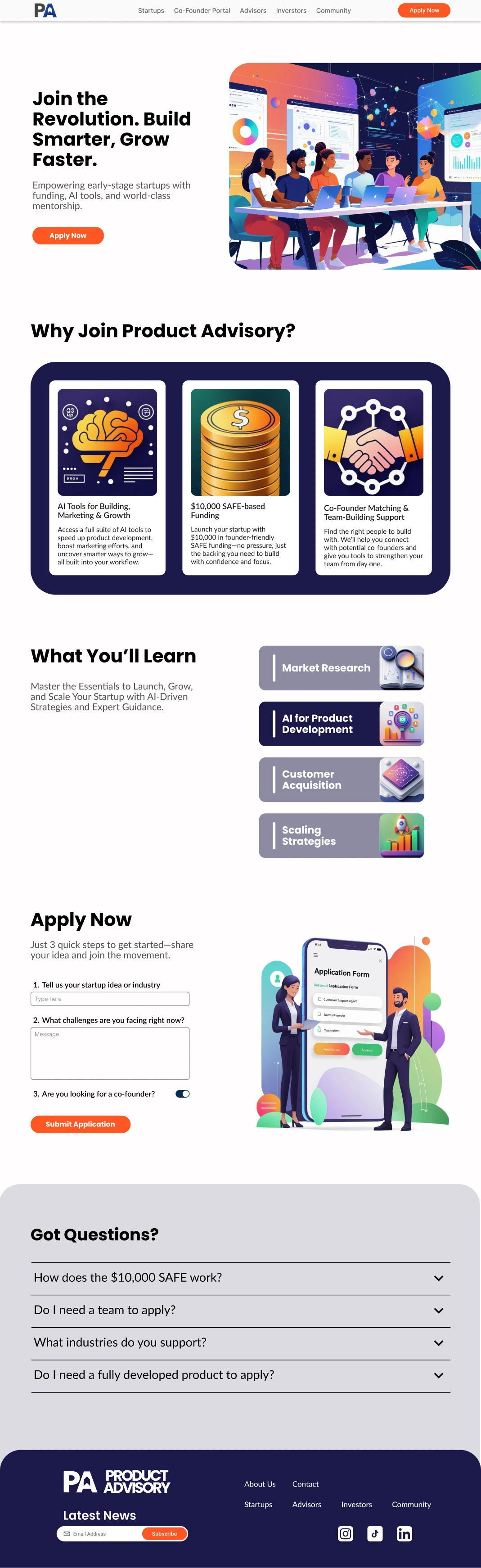
Home Page
Establishes Product Advisory’s identity, clearly communicates the program’s value, and encourages users to apply.
Startups Page
Highlights how the accelerator supports early-stage founders, with strong CTAs and streamlined content blocks.
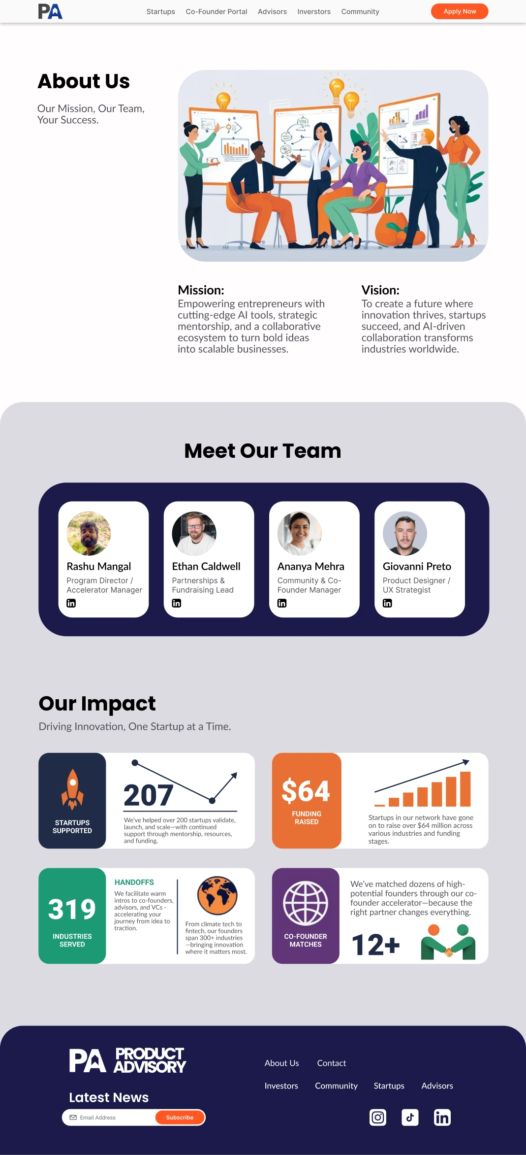
About Us Page
Humanizes the brand and builds trust by introducing the core team, values, and vision—structured with clean typography and balanced visuals.
Final Thoughts
I created a full digital experience for Product Advisory from the ground up - aligned with their goals and optimized for long-term growth. I translated core program values into a modern interface that feels trustworthy, focused, and scalable.
This project strengthened my ability to work cross-functionally and lead the entire web design process—from structure and UI to handoff and feedback.