The Problem
Many travelers struggle to plan their trips in advance, often feeling overwhelmed by the number of options and lack of guidance. This leads to stress and uncertainty once they arrive at their destination — not knowing where to go, what to do, or how to make the most of their time.
Storyboard
The Solution
Goexpp is a simple, personalized way to discover must-see places and must-do activities based on your interests — whether you’re planning ahead or making last-minute decisions on the go.
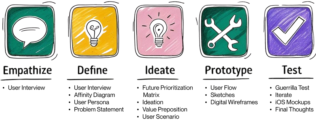
My Approach
User Research
As someone who loves to travel often, I was excited to explore how other people approach planning their trips — especially how the global pandemic may have changed their travel habits.
In this initial research phase, I created a user research plan and interviewed 6 participants from the San Francisco area. They were selected based on a proto-persona I developed during the early stages of the project. My primary goal was to uncover users’ pain points and better understand how they envision traveling in the near future.
To guide the interviews, I defined a few core hypotheses and three key research questions:
- How do people currently make travel decisions?
- What are their typical travel habits
- What was their most recent travel experience like?
Additionally, I wanted to understand:
- What resources and tools people use to plan and during their trips
- What kinds of activities they seek out, and how they find them
Key User Quotes
I want to travel like a local and really take something away from the experience.
The most stressful part of planning a trip for me is finding things to do at the destination — especially if I’m traveling with friends and everyone has different preferences.
I feel the need to have everything planned: where I’m going, who I’m going with, and all the activities I’ll do.
Interview Insights
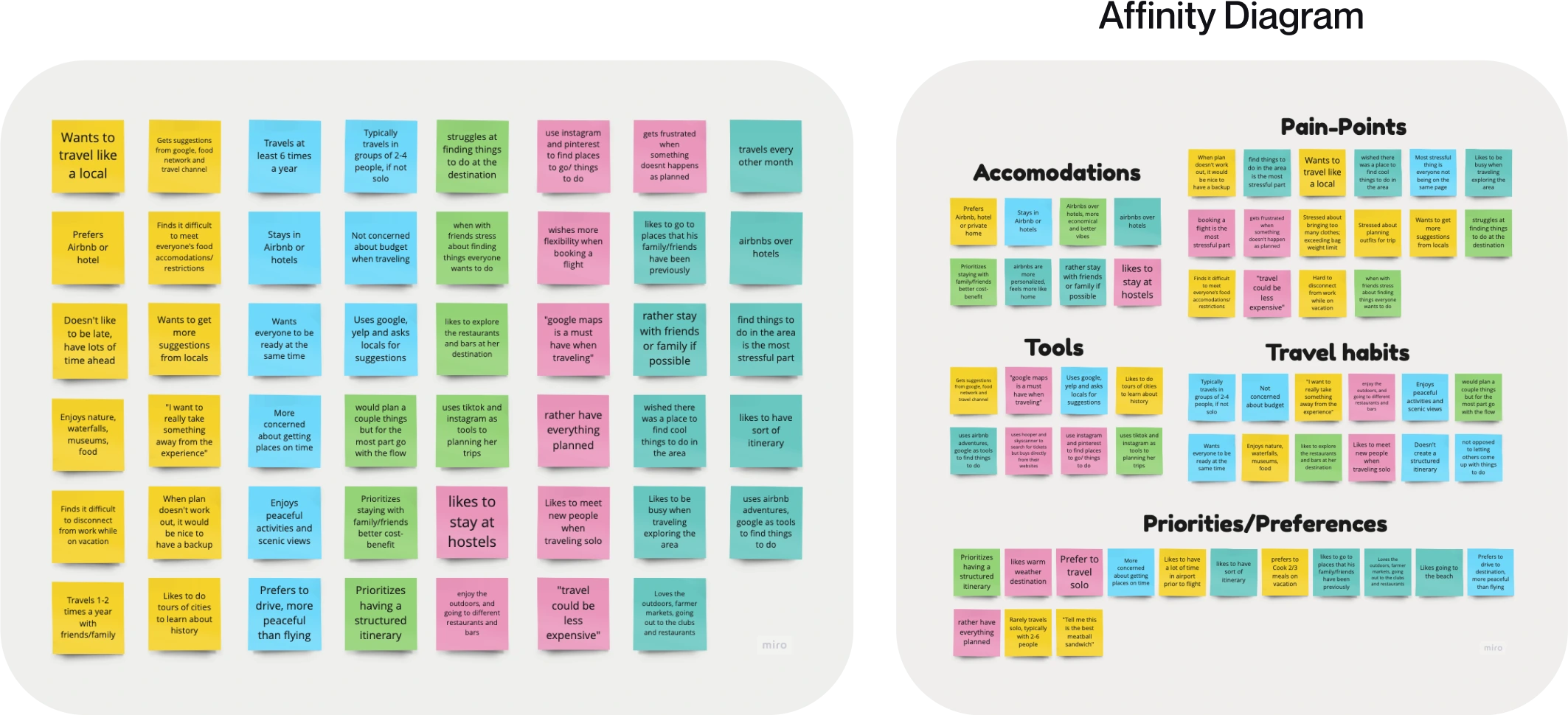
After completing the user interviews, I synthesized the findings using an affinity diagram. I used Miro to map key insights, behaviors, frustrations, and quotes onto virtual sticky notes. By grouping similar responses, I identified common patterns and emerging themes, which helped shape the direction of the product.
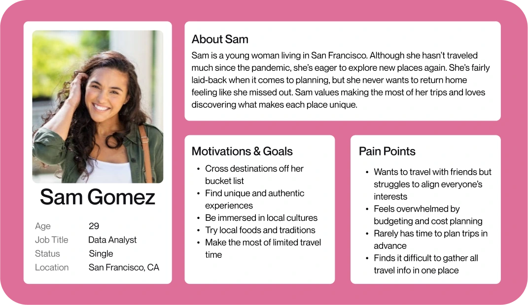
User Persona
To better define the target audience, I created a user persona based on my research findings. This persona helped guide design decisions and prioritize features by keeping user needs at the center of the process.
Meet Sam Gomez
Sam is a young, curious traveler who seeks out unique and memorable local experiences. When she travels, she wants to feel immersed — like she’s truly exploring the destination. She dislikes feeling like she’s missing out and prefers having easy access to events, tours, and hidden gems that match her interests.
Definition & Ideation
To transform my research insights into actionable next steps, I used my user persona to define a clear problem statement and begin ideating potential solutions.
Problem Statement
Young travelers often find it difficult and time-consuming to discover activities and events in unfamiliar destinations. This leads to feelings of stress and frustration during the planning process — and sometimes, even regret after the trip.
I believe I can improve their travel experience by designing a mobile app that helps them easily plan their trip — whether in advance or last minute — so they always return home feeling they made the most of it.
Brainstorming &
Ideation
With a solid problem statement in place, I moved into ideation. I used the “I Like, I Wish, What If” method on a Miro board to generate a wide range of ideas — including some wild ones!
Next, I applied a Feature Prioritization Matrix to narrow down the most valuable and feasible features. I selected three core features to move forward with:
- Users can discover a wide range of activities in one place
- Users can book last-minute experiences if they didn’t have time to plan ahead
- The app learns users’ interests to provide personalized recommendations for each new destination
Value Proposition
To further define the product’s purpose, I asked: “What does this app do better than any other in its category?”
Goexpp helps you make the most of every trip — without the stress.It’s the easiest and smartest way to discover must-do activities and must-see places tailored to your interests, whether you’re planning ahead or making spontaneous decisions on the go.
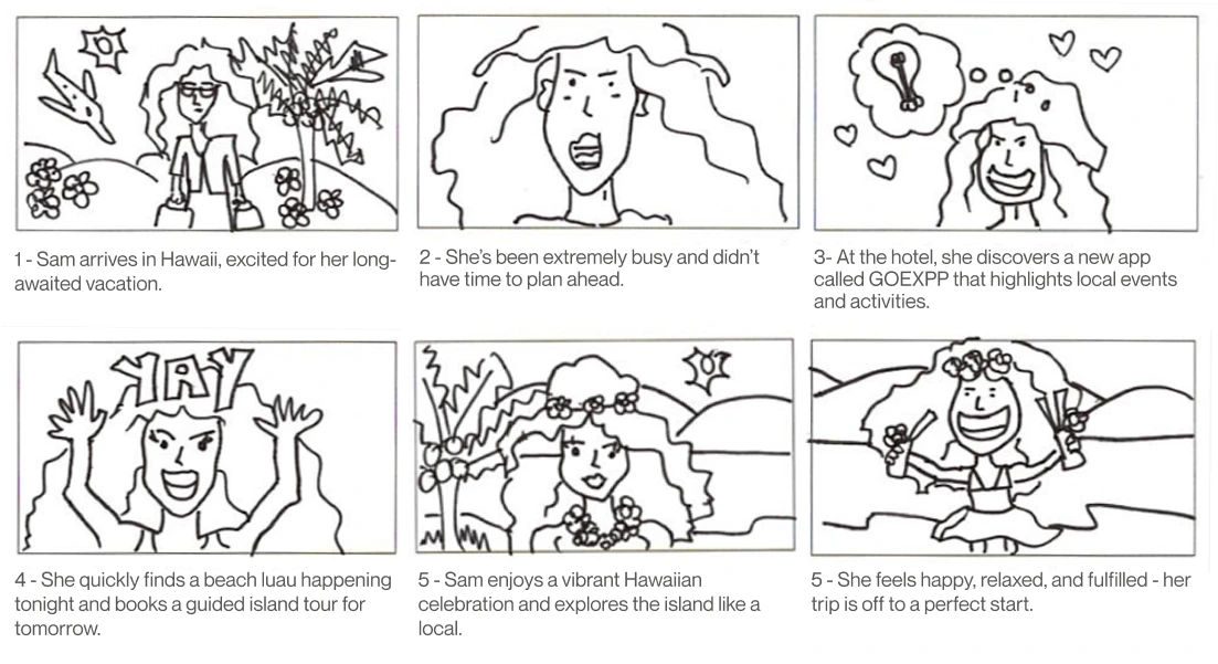
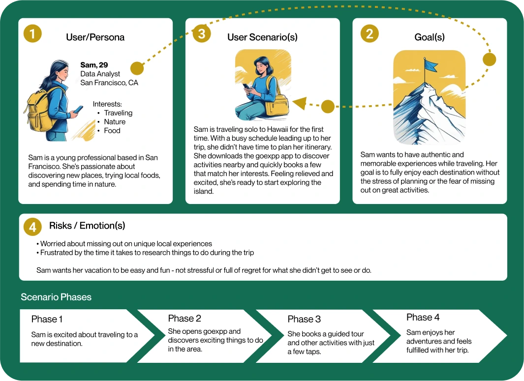
User Scenario
Building on the Value Proposition, I transitioned into storytelling to visualize how a typical user would interact with the product. This step helped me stay user-centered as I explored the product journey from their perspective.
I created a scenario around Sam, my user persona. The scenario outlines her motivations, emotional needs, and the step-by-step experience of discovering and using the goexpp app during her solo trip to Hawaii.
Prototyping
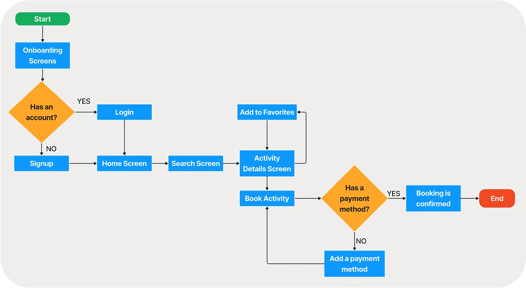
At this stage, it was time to define and visualize how users would interact with the product. Before jumping into paper sketches, I started by mapping out the user experience to better understand the logical steps a user would take to complete a key task.
I created a user flowchart to explore the main interaction: searching for and booking an activity. This helped me organize the app’s core functionality and ensure the flow felt intuitive and goal-oriented from the user’s perspective.
User Flow
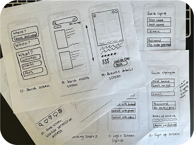
Sketching &
Wireframing
Using the mobile app user flow as a guide, I moved on to paper sketches to begin shaping the interface. Each step in the flow corresponded to a screen that I sketched out by hand.
While designing, I focused on keeping the experience simple and intuitive, following familiar mobile patterns to reduce friction and make the product easy to navigate — even for first-time users.
Turning my paper sketches into digital wireframes allowed me to focus on layout, structure, and usability. I kept things simple and clear to ensure a smooth user flow, especially when searching for and booking activities.
Testing & Iterating
Before investing time in high-fidelity designs, I tested the wireframes to validate the overall concept and ensure the product was usable. Using Figma, I added basic interactions and created a quick guerrilla testing plan with 6 potential users.
While they completed key tasks, I observed their behavior and took notes. The most common issue users encountered was related to app navigation, which gave me valuable insights for improvement.
Iterate &
iOS Mockups
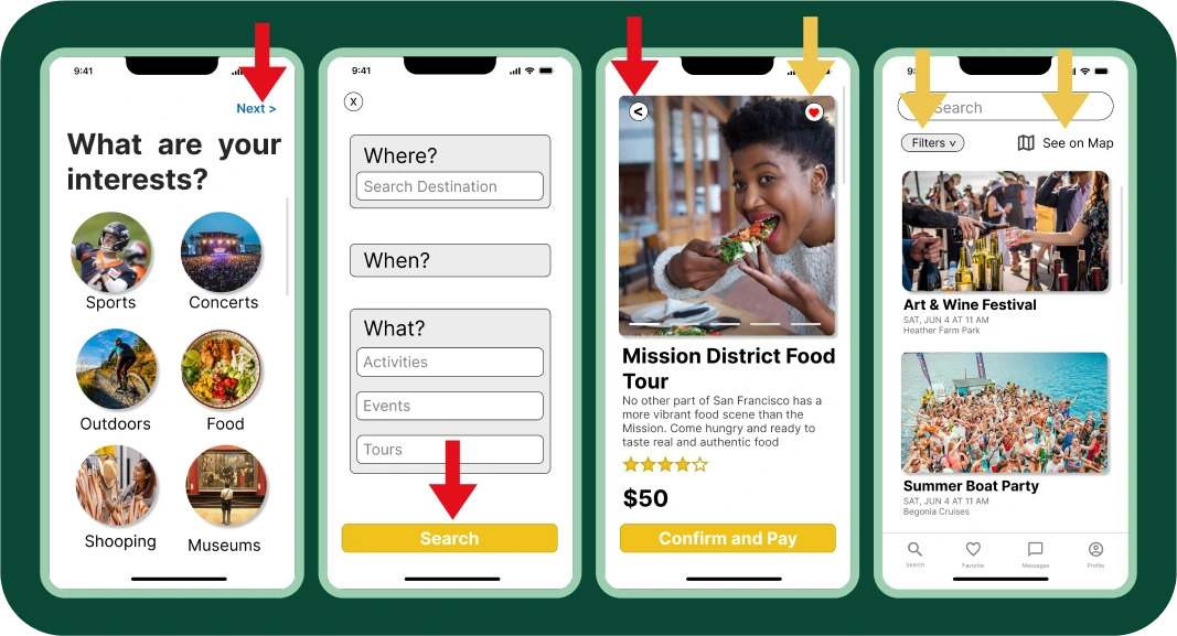
- Red arrows highlight added navigation buttons that were missing and impacted usability.
- Yellow arrows indicate features added based on user suggestions and questions.
These adjustments helped align the app more closely with user expectations and improved the overall experience.
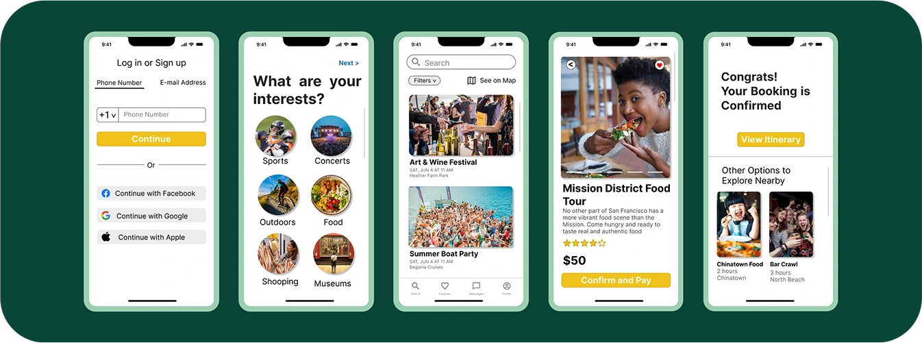
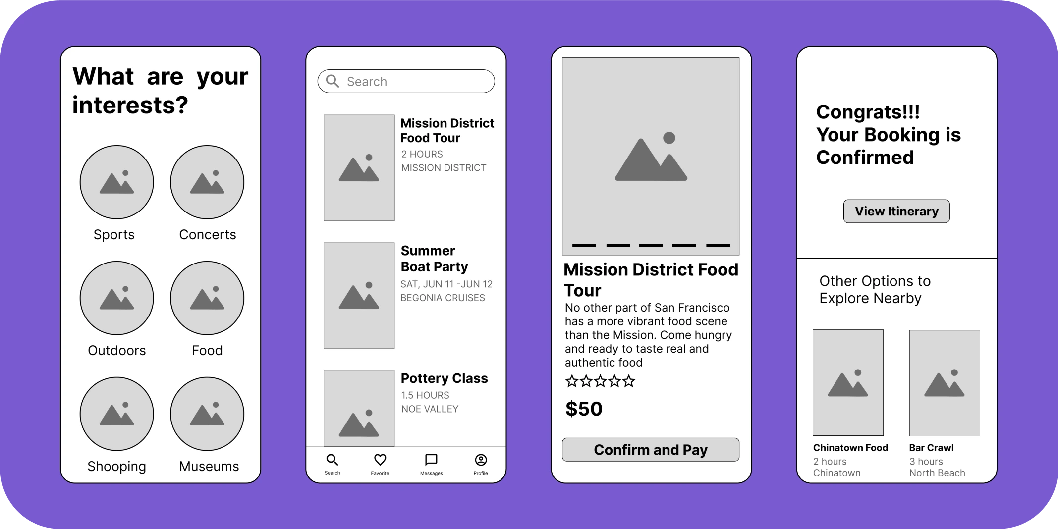
Final Prototype
After refining the design based on user feedback, I created the final high-fidelity prototype in Figma. The result is a clean, intuitive mobile experience that helps users discover and book activities with ease — whether planning ahead or making last-minute decisions.
Take a look at how goexpp works in action:
Lessons Learned
- The UX/UI process takes time — the more time you invest, the better the final product becomes.
- Design is iterative. There’s always room to improve, so keep testing and refining.
- Truly understanding user pain points early on can shape the entire direction of a project.
- Stay focused on the problem — don’t rush into solutions before it’s time.