Background
Pottr is a mobile app concept designed to help San Francisco–based ceramic artists showcase and sell their handmade pieces directly to local buyers. The app offers a curated shopping experience that celebrates craftsmanship, community, and one-of-a-kind design.
As a ceramic artist and designer, I’ve noticed how hard it is for local makers to reach the right audience online without getting lost in mass-market platforms. Pottr aims to create a focused, supportive space where artists can share their work, and buyers can connect with the stories behind each piece.
Design Goals
The goal for this project was to create a user-friendly mobile experience that highlights both the product and the artist behind it. Since ceramics are highly visual and tactile by nature, the UI needed to reflect that sense of warmth, artistry, and clarity.
- Design a mobile-first marketplace tailored to handmade ceramics
- Keep the interface clean, visual-first, and artist-friendly
- Support fast browsing and intuitive purchasing
- Reflect the warmth and individuality of handmade art through tone, color, and layout
UI Showcase
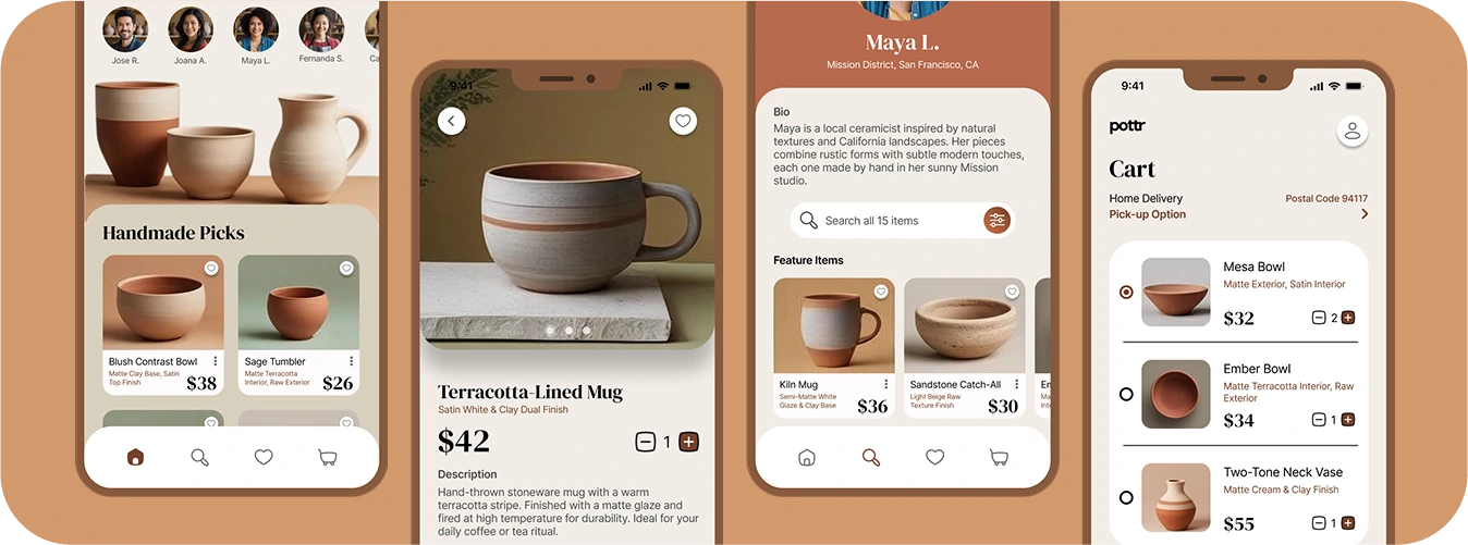
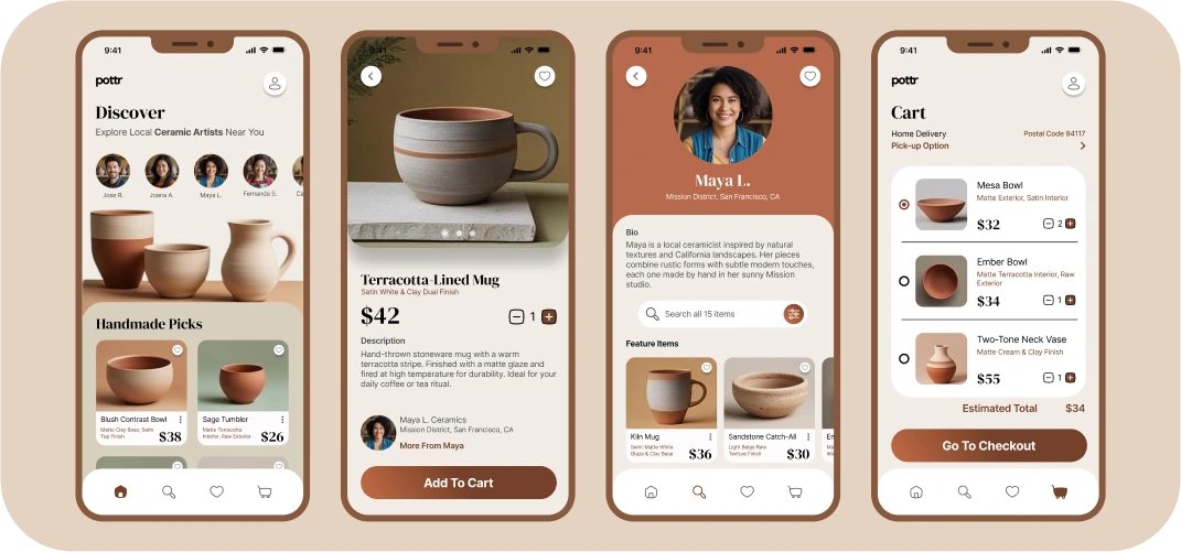
To bring Pottr to life, I designed four key screens that guide users through the core app experience - from discovering local makers to browsing their collections and purchasing unique pieces. Each screen was crafted to highlight the artists behind the work, with a clean and intuitive flow that keeps the spotlight on their creations.
- Home: A curated feed featuring ceramics from local SF artists
- Product Detail: A closer look at a selected piece, including pricing and materials
- Artist Profile: A space to discover the story behind each maker and browse all their available work
- Cart & Checkout: A clean, intuitive flow for reviewing items and completing purchases seamlessly
Visuals include a screen recording of the design process and high-fidelity mockups of each screen.

Final Thoughts
Designing Pottr was a chance to blend two passions—craft and design—into one thoughtful product. By focusing on just four core screens, I was able to streamline the experience and focus on visual clarity and user flow. This case study reflects my approach to UI work that is not only clean and intentional, but emotionally connected to the user’s world. Whether it’s an artist sharing their newest vase or a buyer discovering the perfect handmade mug, Pottr is designed to celebrate those small, meaningful exchanges.